Funny, the things that keep you awake at night – or at least prevent you from having a nice relaxing lie-in on a Sunday morning.
Yesterday Paul went to an Historical European Martial Arts (HEMA) event called Swords of Winter. It was hosted by By The Sword, and featured workshops taught by six expert fencers:
Emilia Skirmuntt: Tomahawk & Bowie knife
Anouk Post: Spadroon
Chloe Headdon: British Military Sabre
Maria Makarova: German Longsword
Chantal Lashmar: Rapier Biomechanics
Steph West: Saviolo’s War Rapier
I was supposed to be going too – and Paul even bought us each a tomahawk especially for the occasion – but sadly the fibromyalgia said no, and I also woke up with germs on the day, so I was glad I’d already given away my place to a friend.

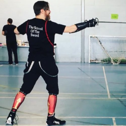
Paul came home from the workshops VERY EXCITED, particularly about Steph West’s workshop on Saviolo’s War Rapier. It’s been a long standing joke at School of the Sword, where we train, that Paul’s sidesword is a little bit ridiculous. It’s too long, it’s too heavy… and it turns out that actually, it’s an almost perfect example of the kind of sword that could be used in Saviolo’s practice!
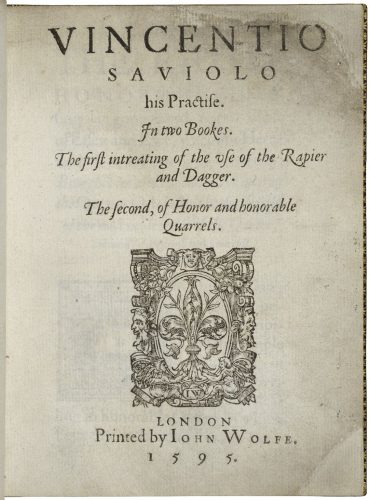
By Vincentio Saviolo (author), John Wolfe (printer) – Folger Shakespeare Library Digital Image Collection http://luna.folger.edu/luna/servlet/s/z4yl4t
As soon as Paul came home, the first thing he did was to look up Saviolo’s fencing treatise – the first to be printed in England, by John Wolfe in 1595. The martial arts school The 1595 Club take Saviolo’s works as their primary inspiration, and they have a biography of Saviolo and a reproduction of his treatise on their website. While Paul was puzzling his way through the somewhat opaque descriptions of how to take on your partner with a rapier and dagger, I was peeping over his shoulder at the book itself.
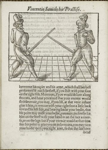
The first thing I noticed was that although the fencing illustrations are very fine, particularly when compared with manuals such as Marozzo’s 1536 Opera Nova, the drop capitals are all over the place! I haven’t been able to find a digitised copy of the complete book online (The Folger Shakespeare Library only have four images), so all I have here is screenshots from what looks like a scanned photocopy, which don’t do justice to the original.
The screenshots are all taken from the Raymond J. Lord Collection of Historical Combat Techniques and Fencing Manuals, at the Arthur F. Kinney Center for Interdisciplinary Renaissance Studies, University of Massachusetts Amherst.
The first book has only a few ornaments and drop capitals. It also only has six images of the fencers, preferring instead to concentrate on lengthy descriptions of the various plays. All of the drop caps in the first book are of the kind featuring a surrounding embellishment with a gap in the centre, into which you then place your required letter. These are an excellent solution if you don’t want to buy a complete fount of fancy drop capitals. During this period both typefounding and printing in England were strictly controlled by both the Stationers’ Company and the Star Chamber. Types were often imported from the Netherlands and, particularly with decorative pieces, printers may have bought simply the letters that they needed, or the few that they could afford. Both of these pieces of ornamentation are used multiple times throughout both the first and the second books.
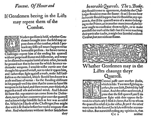
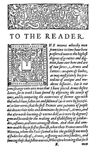
The second book shows a lot more variation. It has a combination of woodcut capitals and the same drop-in ones as the first book. The large ornament across the top of the page is also used multiple times throughout. Interestingly, the woodcut capitals are not all in the same style. Most are floral and from the same typeface, one includes a figure, and two are rectangular rather than square. I’d love to have a look at an original copy, or a high-resolution scan, so I could see the details properly.
John Wolfe, the printer, appears to have been something of an interesting character. From 1591, complaints were brought against him that he was re-printing a wide variety of books to which other printers owned the rights. He was working under the auspices of the Fishmongers’ Company (his father may have been a fishmonger), which meant that he was not bound by the rules of the Stationers’ Company regarding what he could and couldn’t print, and he strongly resisted all entreaties to join. He persisted in this, despite a period of imprisonment, until 1587 when a set of complicated circumstances saw him take up the position of acting beadle of the Stationers’ Company. Following this appointment he became particularly adept at prosecuting illicit printers, many of whom he had previously worked with.
Interestingly, by 1595 Wolfe was no longer running his own press, having moved largely into publishing. It seems likely that Saviolo’s treatise was actually printed by either Adam Islip (who printed all three editions of Gerard’s Herball) or John Windet, despite Wolfe’s name appearing on the title page.
The Elizabethan period is such a fascinating time in the history of English printing. I really need to dig out all of my undergrad Typography books and refresh my poor old memory!